BRING MORE
VENDORS TO
TooGoodToGo

BRING MORE
VENDORS TO
TooGoodToGo

BRING MORE
VENDORS TO
TooGoodToGo

Project Overview

As a culinary assistant at a local Madison restaurant, I’ve observed that food waste continues to be a significant challenge. The "TooGoodToGo" app seeks to address this issue by offering surplus food at reduced prices. While the app thrives in larger cities with abundant food options, Madison faces a lack of participating stores and restaurants. This research explores the opportunities and challenges the app poses for local store and restaurant owners, aiming to encourage their active participation.

ROLE

ROLE

UX Researcher

DURATION

3 Months

3 Months

TOOLS

TOOLS

UXtweak

UXtweak

Madison

New York

Compared to larger cities, only a limited number of

stores and restaurants in the Madison area use the TooGoodToGo app.

Compared to larger cities, only a limited number of

stores and restaurants in the Madison area use the TooGoodToGo app.

Compared to larger cities, only a limited number of

stores and restaurants in the Madison area use the TooGoodToGo app.

Goal

This research aims to identify pain points for stores and restaurants using the TooGoodToGo app and provide design recommendations to enhance user experience and encourage more store and restaurant participation. To achieve this goal, my research focuses on two key questions:

  1. How do users navigate the TooGoodToGo app to place orders, and how does this process reflect the app’s usability?
  1. How do users navigate the TooGoodToGo app to place orders, and how does this process reflect the app’s usability?
  1. How do users navigate the TooGoodToGo app to place orders, and how does this process reflect the app’s usability?
  1. How efficiently can store/restaurant owners or employees learn to use the app, and how well does it demonstrate its ability to address food waste and encourage participation?

  1. How efficiently can store/restaurant owners or employees learn to use the app, and how well does it demonstrate its ability to address food waste and encourage participation?

  1. How efficiently can store/restaurant owners or employees learn to use the app, and how well does it demonstrate its ability to address food waste and encourage participation?

Usability Test

To address my research questions, I conducted a usability test to observe user behavior on the app in real time and gather actionable insights for enhancing its user experience and effectiveness.

Tasks

  1. Search Meal Options and Add to Favorites

  2. Choose My Meal and Make an Order

    The first two tasks showcase how customers interact with the app, helping business owners understand the ordering process with their stores. These tasks were chosen to demonstrate the app’s user-friendliness and its potential to reduce food waste.


  3. Add Your Store or Recommend a Store to Join the Platform

    The third task was selected to demonstrate how stores and restaurants can join the platform as partners.

Measures

  1. Time on Task

  2. In-Test Qualitative Questions

    I chose time-on-task and in-test questions to measure user efficiency and identify challenges. Time-on-task highlights areas where users struggle, while in-test questions provide qualitative insights into their difficulties, offering a balanced understanding for improvement.

Participant Recruitment Process

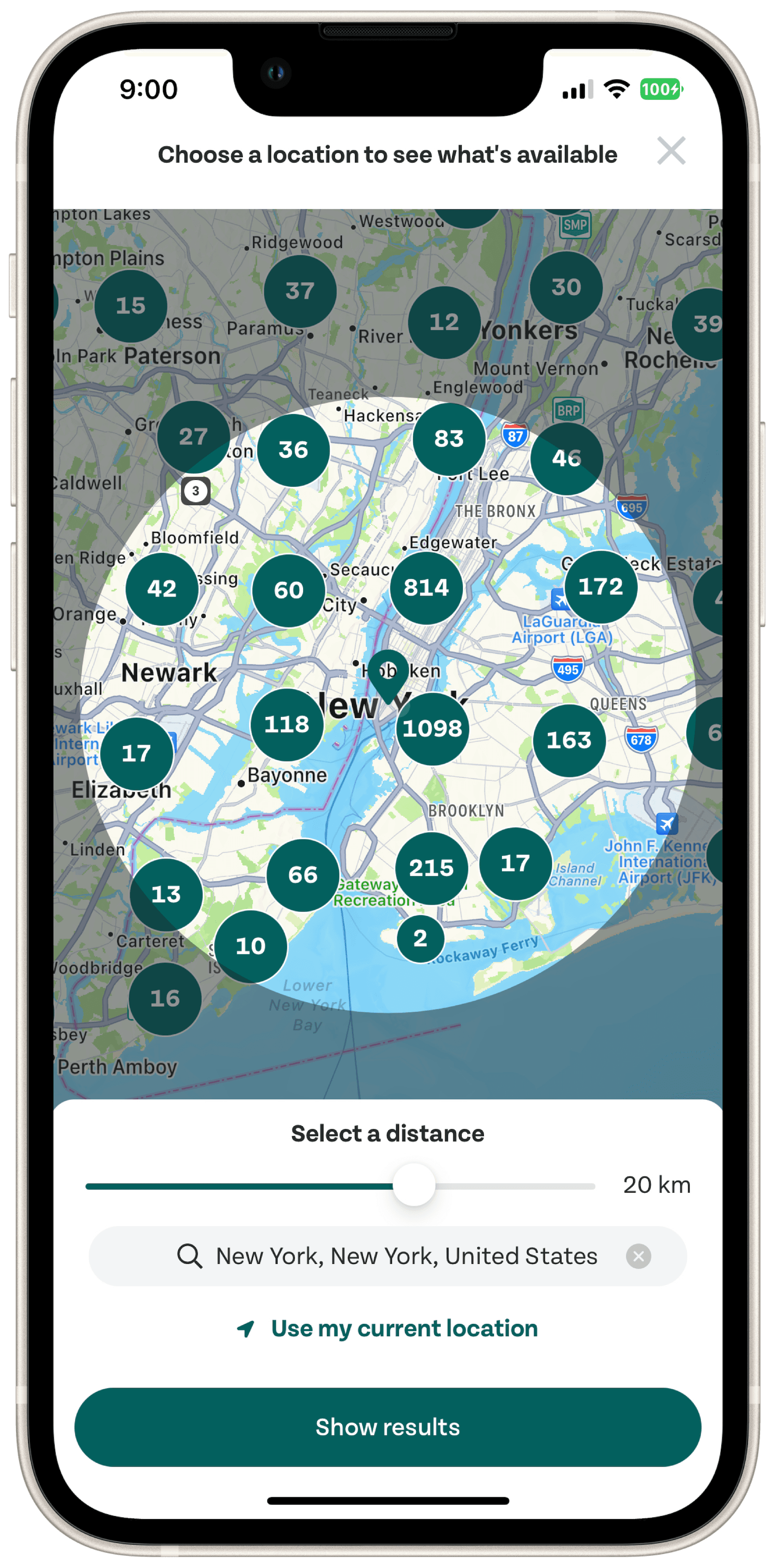
My goal is to explore opportunities for local restaurants and stores in Madison to join this platform.

  1. I employed intercept studies as my recruitment method, engaging directly with individuals in their work environments.

  1. Participants were required to meet specific criteria for this study. To ensure they met these requirements, I used screener questions to identify suitable candidates. (Please click the link to see details of the screener questions.)

Based in Madison

Based in Madison

Based in Madison

Restaurant/Store Work Experience

Restaurant/Store Work Experience

Restaurant/Store Work Experience

Eco-Conscious Users

Eco-Conscious Users

Eco-Conscious Users

Active in Local Activities.

Active in Local Activities.

Active in Local Activities.

Comfort with Mobile Apps

Comfort with Mobile Apps

Comfort with Mobile Apps

  1. Ultimately, I successfully recruited two restaurant employees, two managers and one store owner to participate in this study.

Process of conducting the usability test (photos shared with participant consent).

Process of conducting the usability test (photos shared with participant consent).

Process of conducting the usability test (photos shared with participant consent).

Refinements During the Usability Test Process

Refinements During
the Usability Test Process

Research Questions

Research Questions

Initially, my research focused on streamlining processes for business-side users. However, I realized participants were also concerned about customer interactions. To address this, I added a research question highlighting customer operations to demonstrate the app’s usability for both sides.

Initially, my research focused on streamlining processes for business-side users. However, I realized participants were also concerned about customer interactions. To address this, I added a research question highlighting customer operations to demonstrate the app’s usability for both sides.

Metrics

Metrics

I originally planned to use Single Ease Questions (SEQ) to evaluate ease of use. However, I realized this approach provided only surface-level insights without uncovering the reasons behind. I switched to In-test questions for more detailed insights into participants’ motivations and challenges they encountered.

I originally planned to use Single Ease Questions (SEQ) to evaluate ease of use. However, I realized this approach provided only surface-level insights without uncovering the reasons behind. I switched to In-test questions for more detailed insights into participants’ motivations and challenges they encountered.

Testing Process

Testing Process

I observed differences in participant experience: those familiar with the app completed tasks effortlessly, while new users struggled to understand the tasks. To address this, I adjusted my approach by providing clearer instructions and additional context to ensure all participants could engage effectively.

I observed differences in participant experience: those familiar with the app completed tasks effortlessly, while new users struggled to understand the tasks. To address this, I adjusted my approach by providing clearer instructions and additional context to ensure all participants could engage effectively.

Issues

Business-side participants highlighted that customer ease of use is key to their decision to join the platform. While they found the app generally easy to operate, with average task times of 3:15 (Search Meal Options), 1:37 (Make an Order), and 2:00 (Add/Recommend a Store), they noted specific pain points that need improvement.

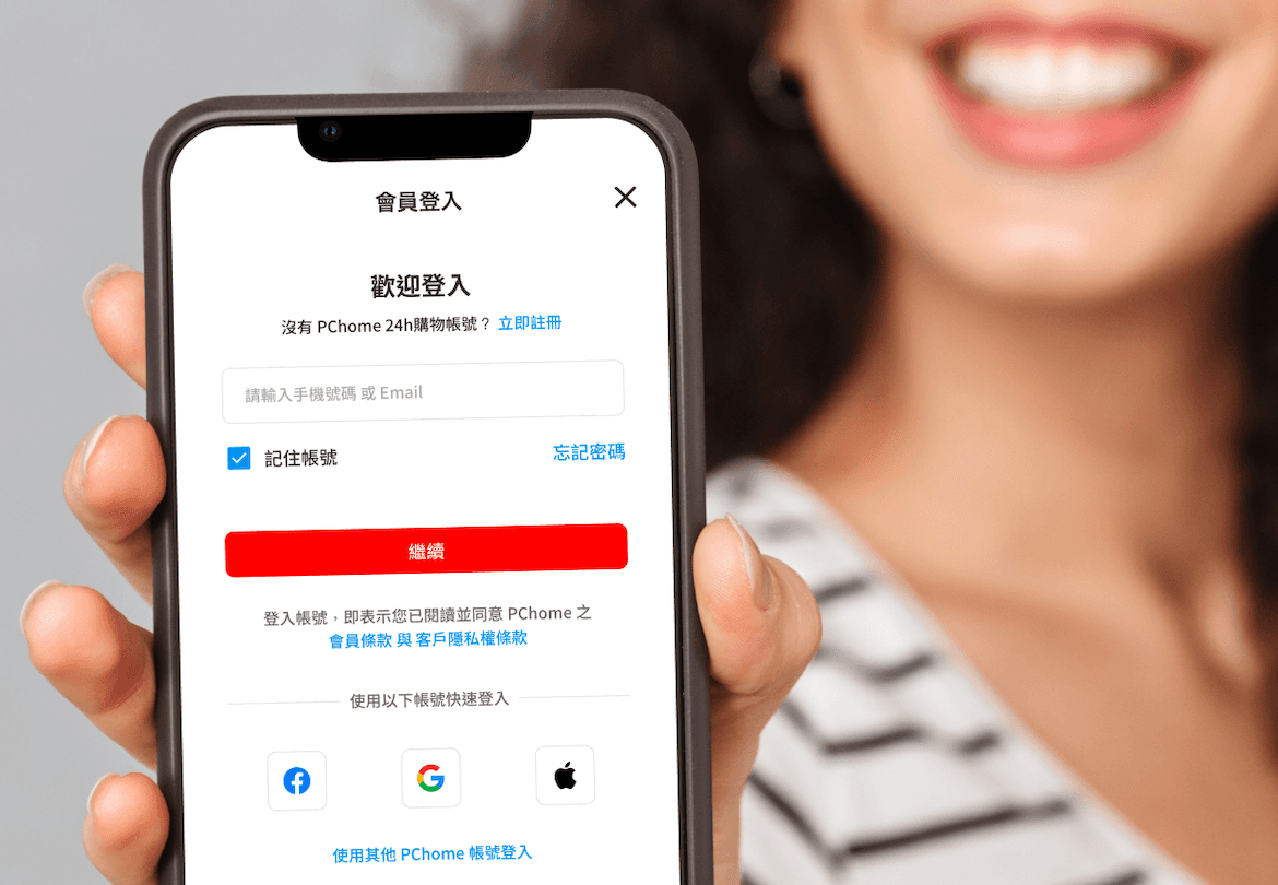
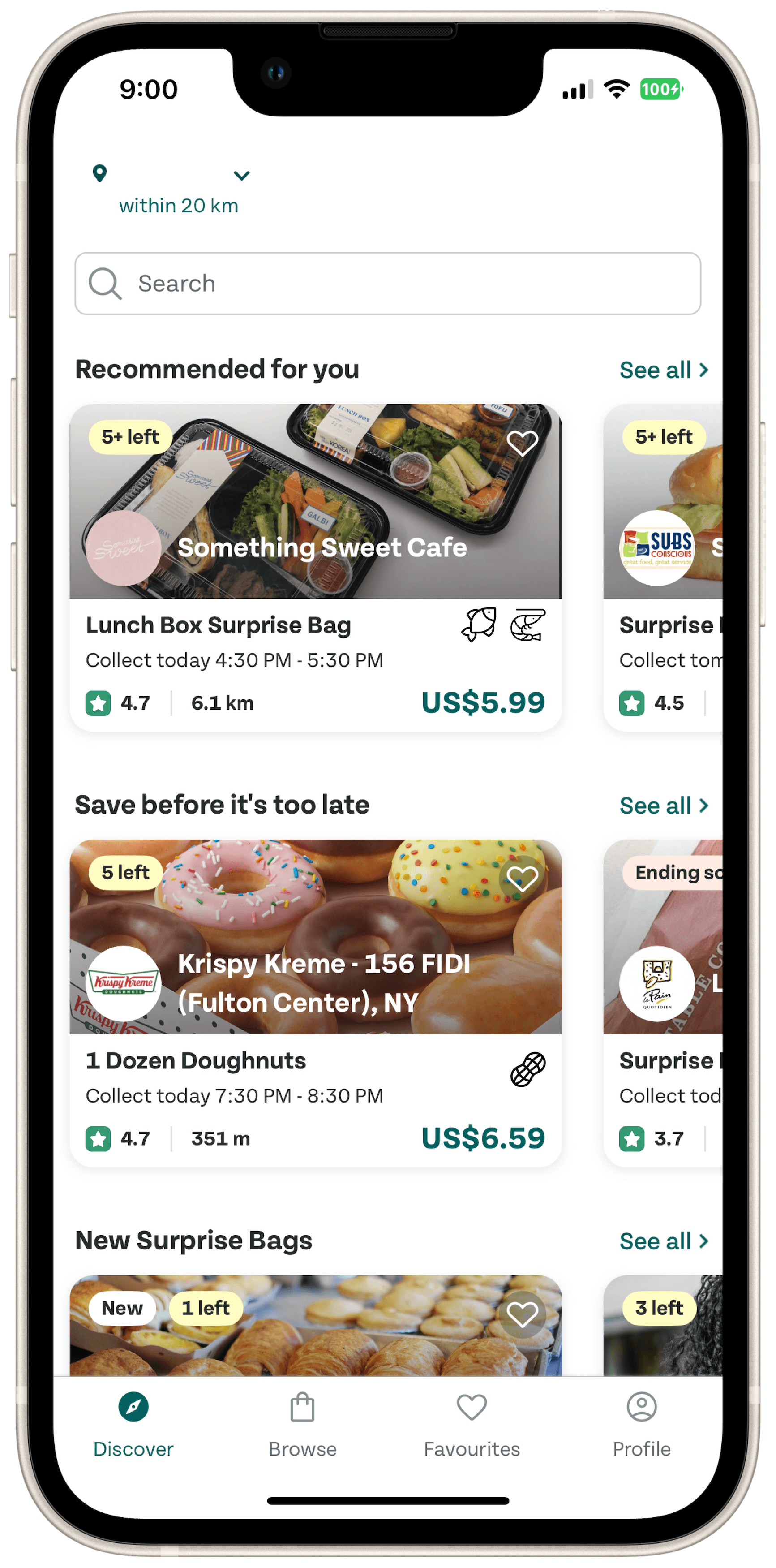
  1. Difficulty Signing Up or Recommending Stores/Restaurants

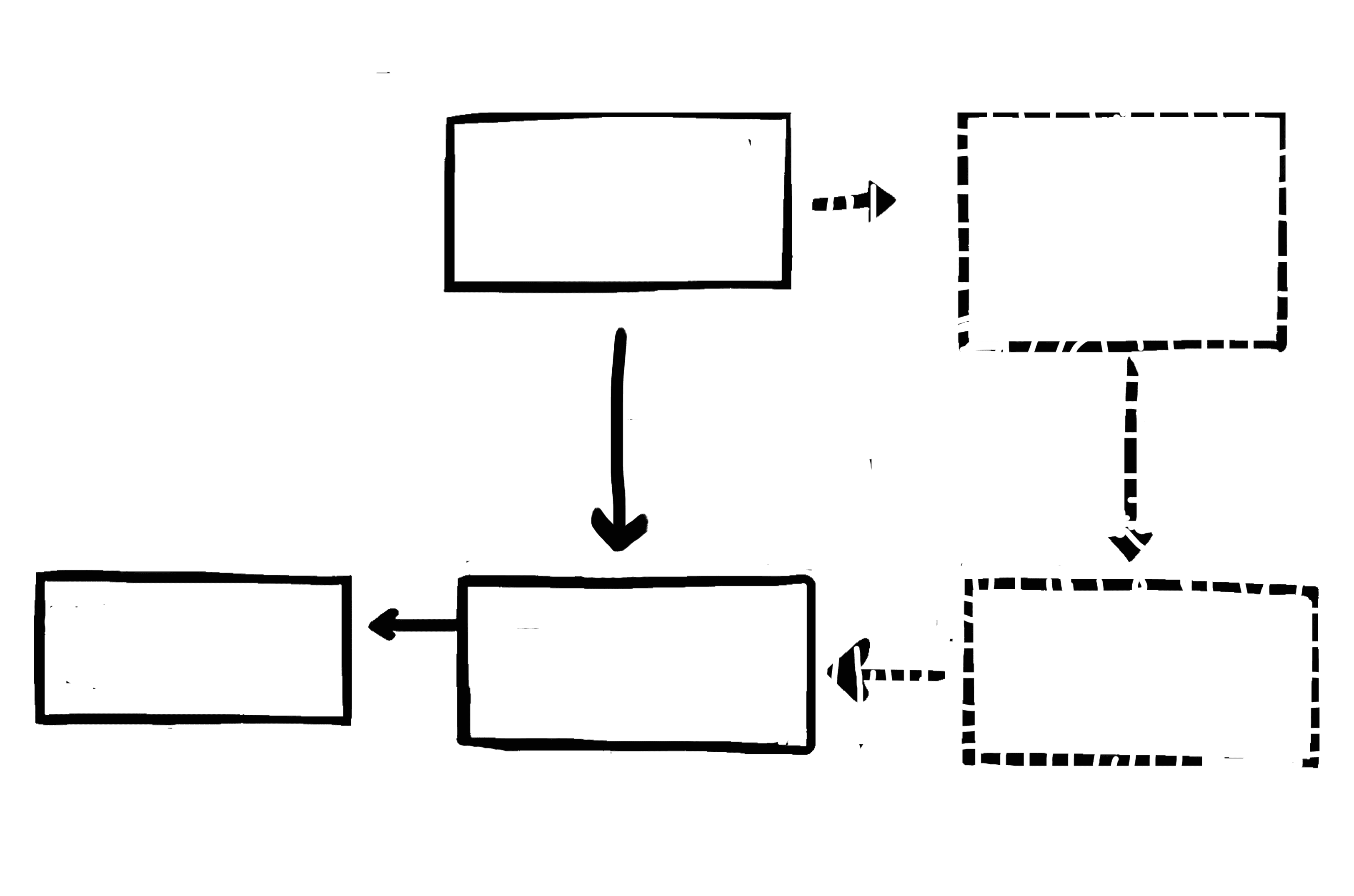
Three participants struggled to find the functionality buried in the second layer of the "Profile" page. One began by exploring "Discover," then "Browse," before reaching "Profile," noting she didn’t expect it to be under "Profile," let alone its second layer.

"Join this platform?… Hmmm, I think I can find it on the Discover page." — D, Employee

One participant’s navigation path to locate the "Recommend a Store" function.

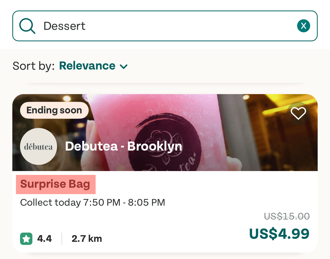
Although participant selected "Dessert," it still appeared as "Surprise Bag," raising concerns about transparency.

  1. Concern of Surprise Bag

During the "Make an Order" task, four participants completed it effortlessly but raised a shared concern: the lack of transparency about the contents of the "Surprise Bag," which could discourage customers from making a purchase.

"What if customers are allergic to the product? The Surprise Bag could lead to serious issues." — Y, Manager

  1. Lack of Autofill functions

Two participants highlighted the absence of search autofill, which left one unsure whether to search by restaurant name, food name, or another term. Compared to apps like Uber, this lack of guidance hindered usability.

"Should I type in the category or product name?" — R, Employee

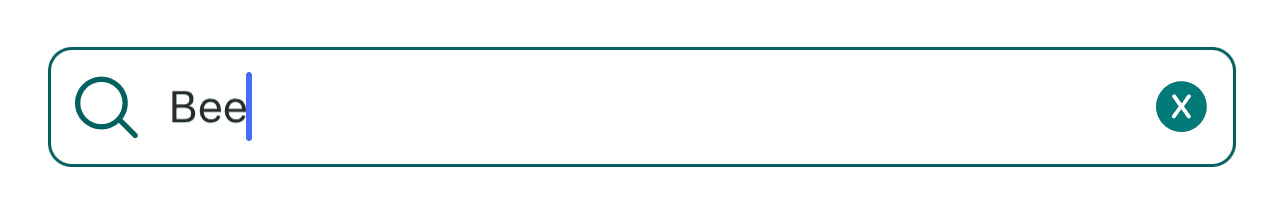
Do not have any hint or autofill function in the search bar.

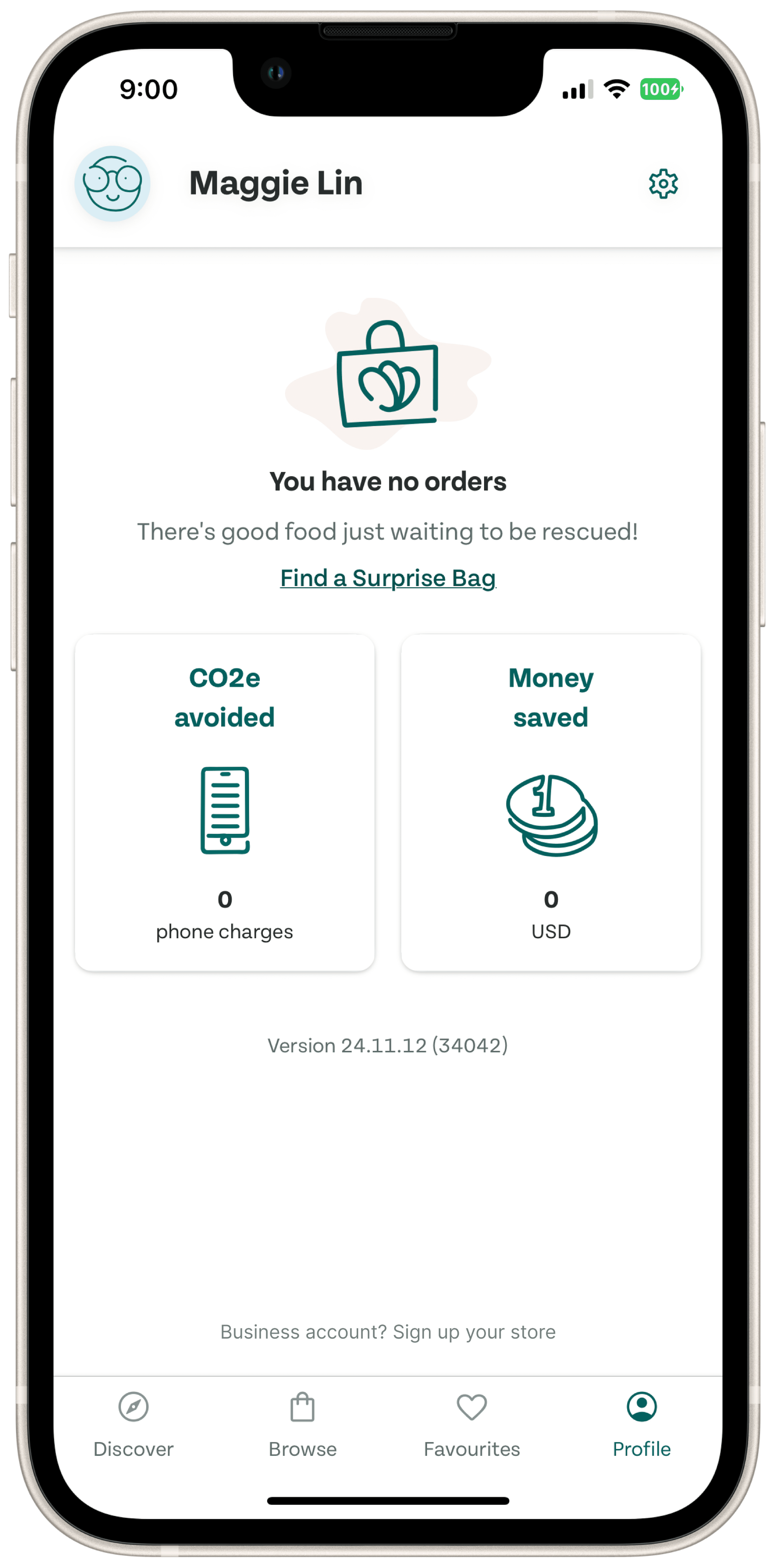
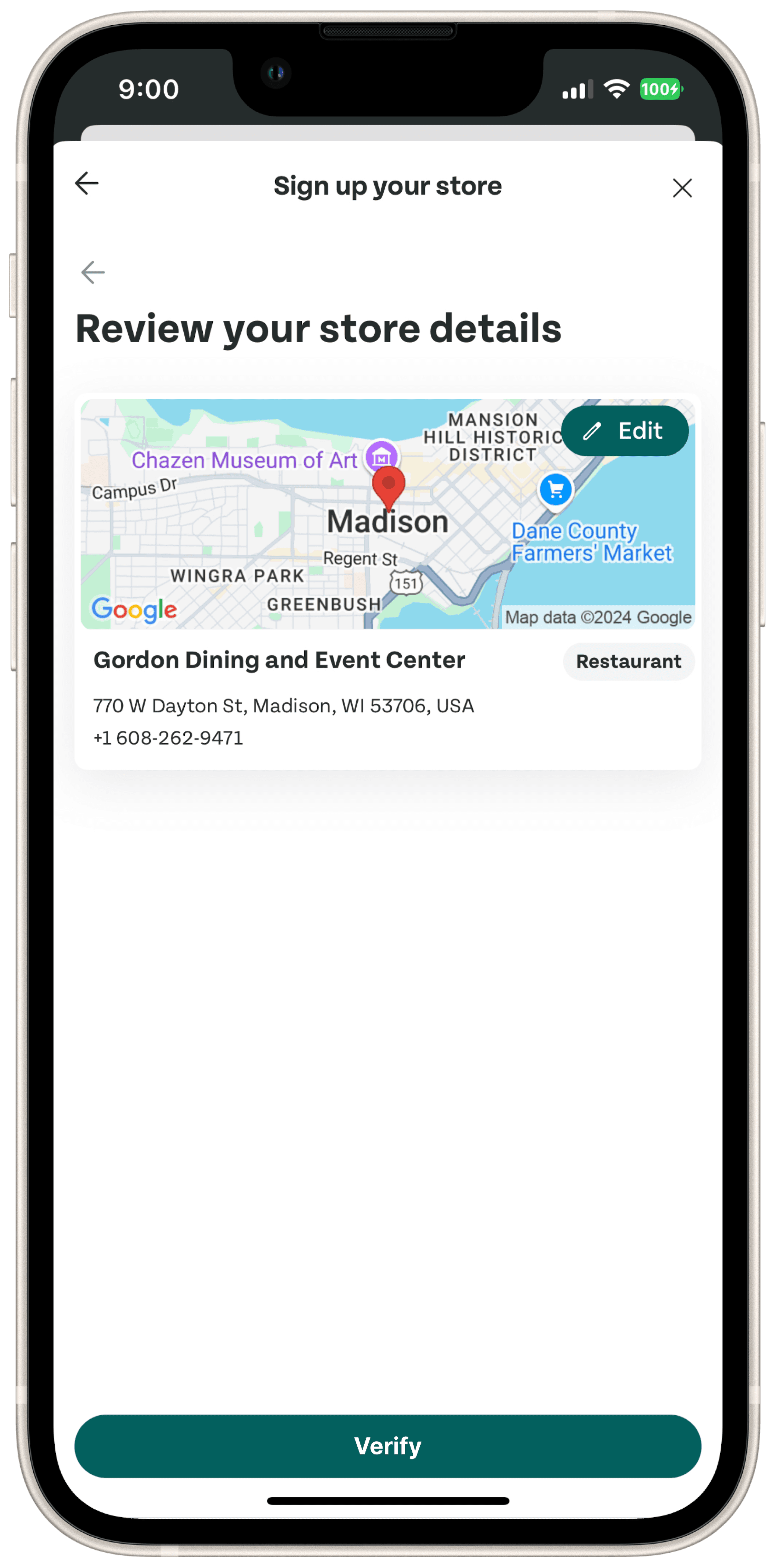
  1. Lack of Store Ownership Verification Mechanism

The sole shop owner participant used the "Sign Up for Stores" function instead of the "Recommend" feature. While she signed up effortlessly, the app lacks a verification mechanism to confirm store ownership, potentially allowing illegitimate registrations and customer issues.

"When I clicked the 'Sign Up Your Store' button, I just followed the steps, and now I own the store… but I’m not supposed to be the owner!" — J, Store Owner

Design

Reflection

Looking back on this design process, I’ve gained several key insights that will significantly shape my future projects.

  1. Task Complexity Can Lead to Bias

Allowing too much flexibility in tasks can result in biased outcomes. For instance, when I asked participants to find a dish they wanted, some spent excessive time deciding what to choose instead of focusing on completing the task. This affected the accuracy of the time-on-task metric. To improve, I plan to set clearer boundaries for tasks in the future, reducing unnecessary decision-making and ensuring more precise measurements.

  1. Correlated Tasks Reduce Participant Confusion

Continuous, related tasks can help participants stay focused and avoid confusion. In my study, the first two tasks aimed to demonstrate how easily participants could navigate the app as customers. However, transitioning to the third task, where they were asked to perform a business-side action, caused some participants to feel disoriented. Shifting perspectives from customer to business user required additional explanation, which could have been avoided with better task alignment. In the future, I will design tasks that are more closely correlated to maintain context and minimize confusion for participants.

These experiences have provided valuable insights and will enable me to design more effective usability tests in the future.

Let's Have Some Fun Together!

Copyright © 2025 Maggie Lin. All rights reserved.

Let's Have
Some Fun Together!

Copyright © 2025 Maggie Lin. All rights reserved.

Let's Have Some Fun Together!

Copyright © 2025 Maggie Lin. All rights reserved.