SIGN-UP/LOGIN
REDESIGN
SIGN-UP/LOGIN
REDESIGN

Project Overview
For over 20 years, PChome's website has been a part of life for 10M+ members. But for a long time, signing up and logging in wasn’t as easy as it should’ve been. I stepped in to redesign the experience by clearing up confusion, removing friction, and making it easier for people to get started.
* Launched in 2023, this design remains active and in use.
ROLE
Lead Product Designer / UX Designer
Lead Product Designer /
UX Designer
DURATION
6 Months
DESIGN TOOLS

Axure
Before

After
Results
30% Increase in Accessibility Efficiency
30% Increase in
Accessibility Efficiency

25% Reduction in Customer Complaints
New Growth Opportunities
Design Challenges
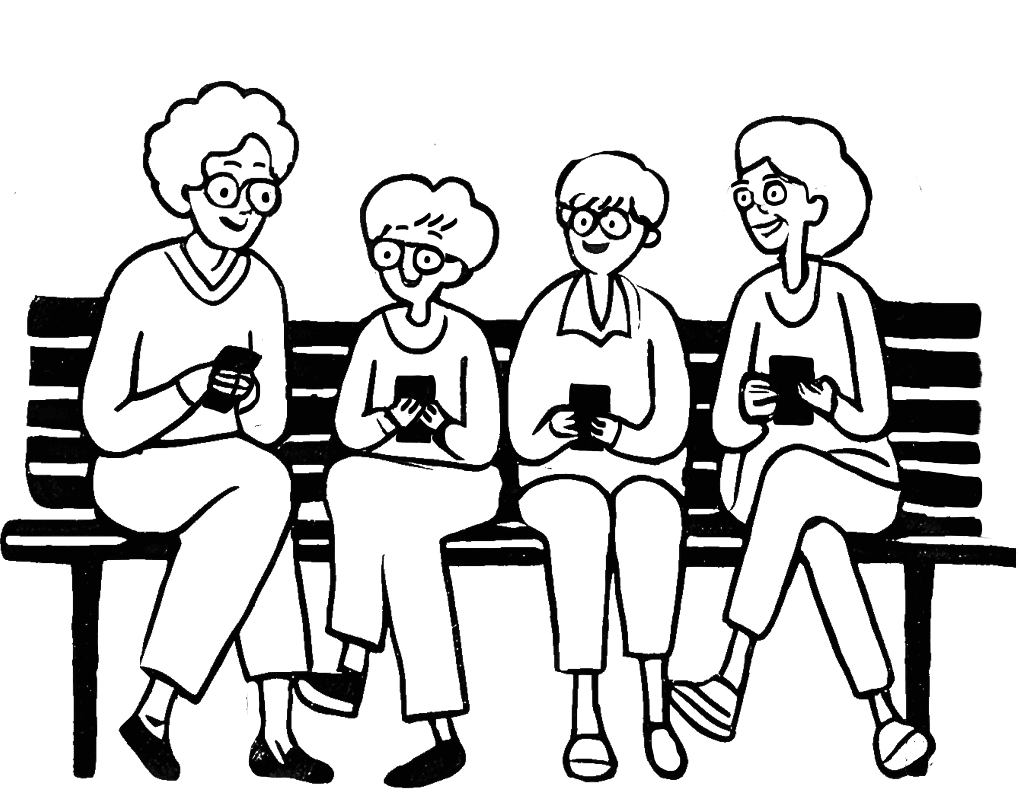
Prior to starting this project, we received user feedback indicating difficulties with logging into our website. Since PChome allowed users to create unlimited accounts, many ended up with multiple accounts, often forgetting their passwords or which account they had used. With these issues in mind, we decided to conduct a thorough review of our login and sign-up systems to identify and address the underlying causes.
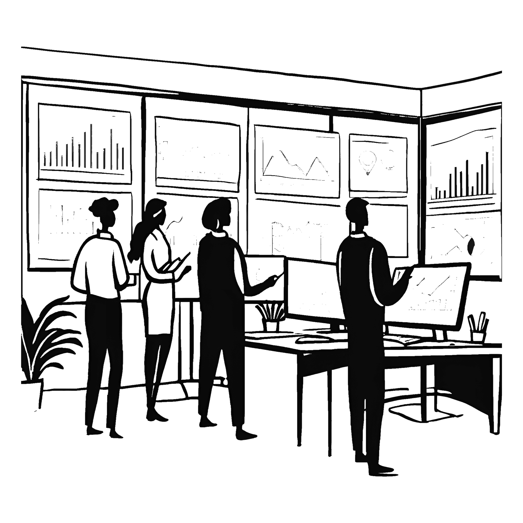
To gain a deeper understanding of our users, I conducted stakeholder interviews, analyzed data from Google Analytics, and extensively studied competitors. This research revealed two major issues: excessive and inconsistent elements on the website created confusion in operations, and users often forgot which account they were using. This was largely due to the lack of account sign-up restrictions, allowing users to create multiple accounts freely. To address these issues, I decided to focus on the following questions:

How might we enhance the clarity of instructions and evaluate the necessity and unnecessity of sign-up and login pages?
Agile Project Management
To ensure users could experience improvements quickly, the project was divided into three phases to prioritize critical updates and gather feedback iteratively. This approach minimized disruptions and ensured each phase delivered measurable value.
Clear Guidelines

Workflows & Interfaces

Feature Enhancements
Scrum & Kanban
Given resource constraints and overlapping projects, I broke these phases into Scrum sprints and used Kanban to monitor workflows. One challenge I faced was the unexpected reallocation of resources to other projects, disrupting our timeline. By leveraging these methodologies, I quickly reprioritized tasks, adjusted our timeline, and reallocated resources efficiently.
Design Response
Phase I: Clear Guidelines
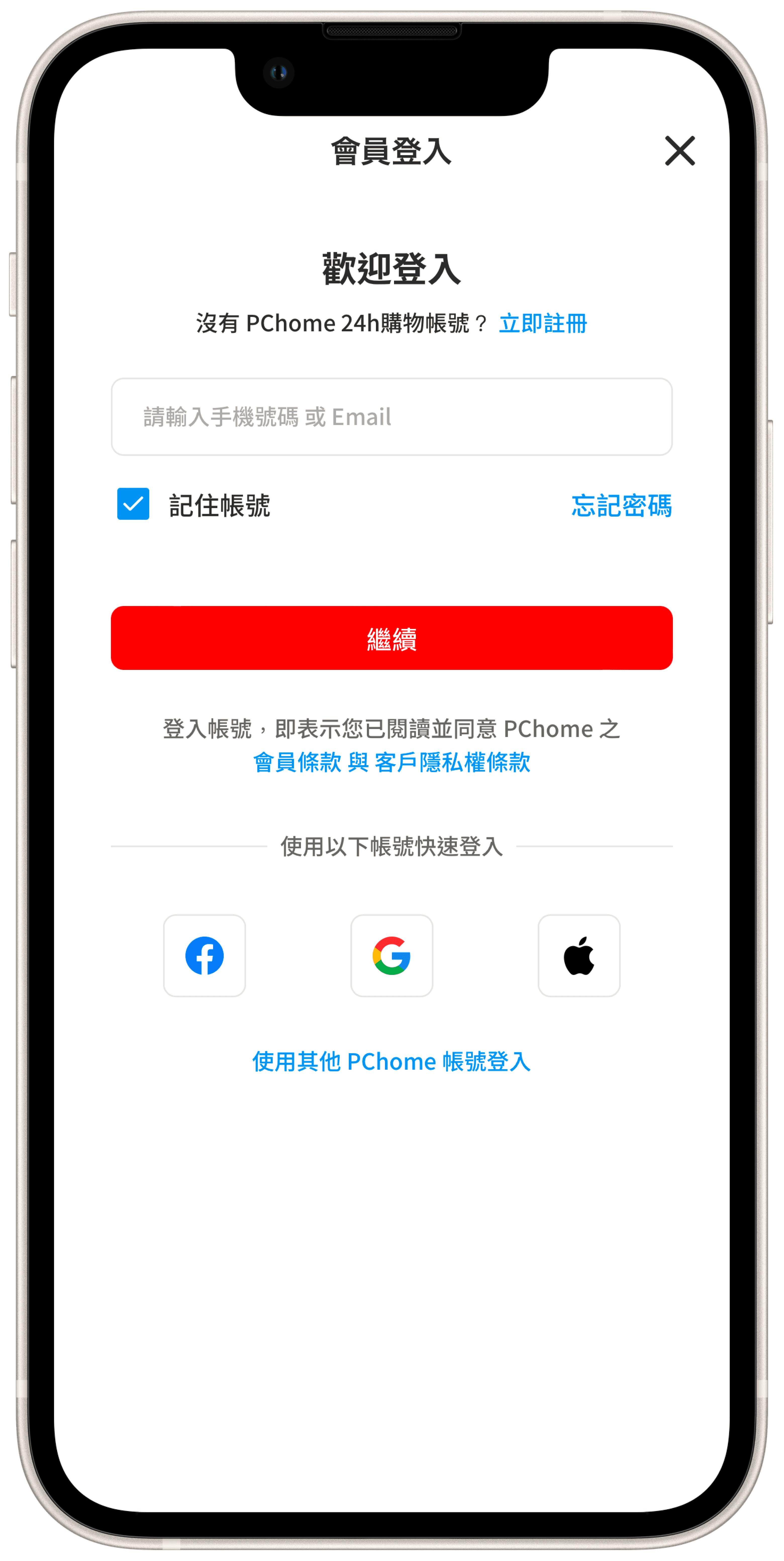
I understood that users struggled with logging into our system, so our first improvement was to make the login instructions more clear and visible. This included providing explicit hints, such as the required number of password digits, to guide users seamlessly through the process.
Before
|
After
The new hint allows users to understand what to type in the password field.
Before
|
After
The new hint allows users to understand what to type in the password field.
Phase II: Workflows & Interfaces
Flowchart
|
Wireframe
|
Mockup
Mockup of the new interface (visual design created in collaboration with our UI designer).
Phase II: Workflows & Interfaces
Flowchart
|
Wireframe
|
Mockup
Mockup of the new interface (visual design created in collaboration with our UI designer).
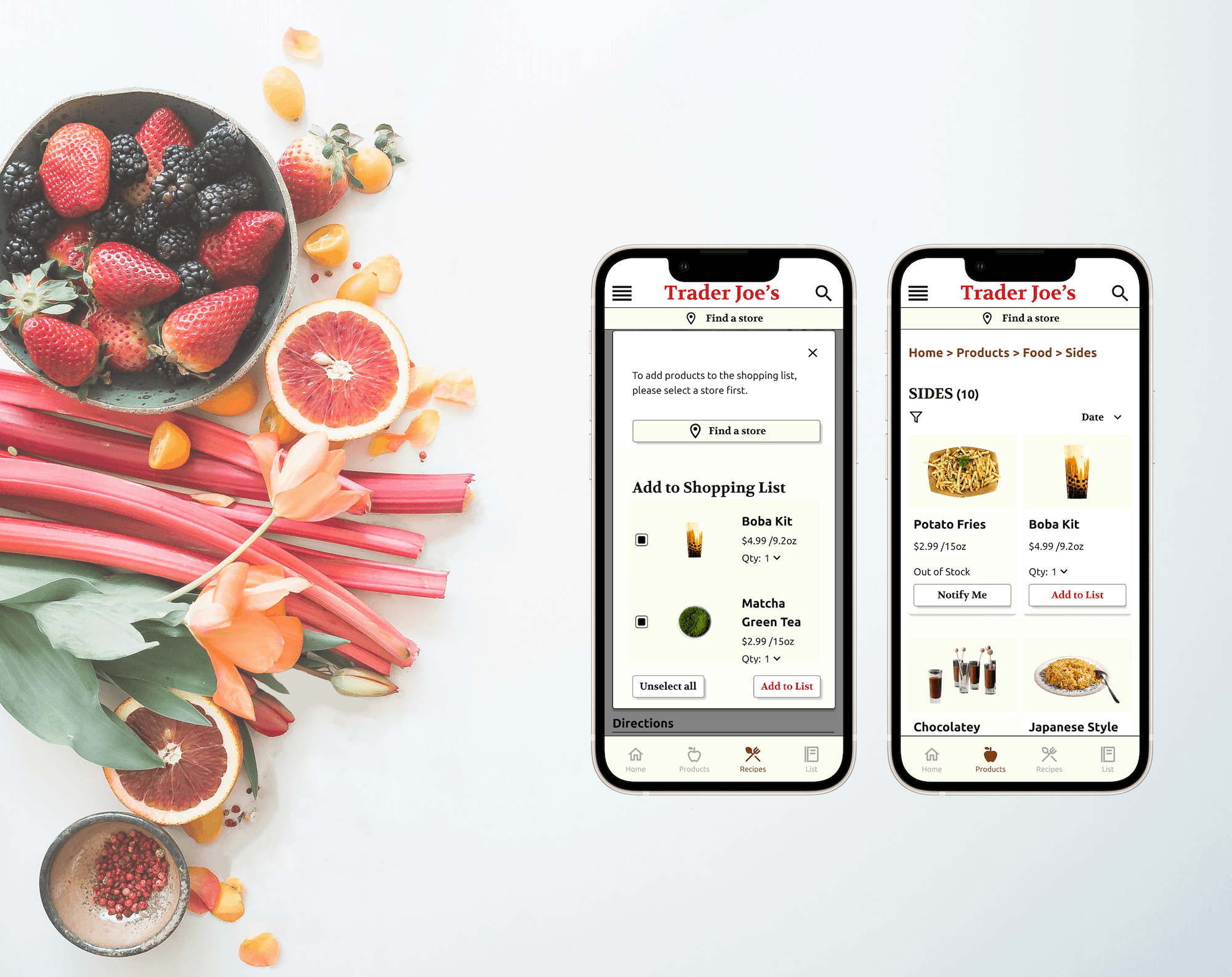
Phase III: Feature Enhancements
After refining the main login and signup flow, I focused on enhancing the user experience by improving additional features, such as enabling users to link or unlink third-party accounts directly from their profile page.
Users can link their third-party accounts for added convenience.
Users can link their third-party accounts
for added convenience.
Reflection
Looking back on this design process, I’ve gained several key insights that will significantly shape my future projects.
1. Balancing Design Strategy with Practical Constraints
While ideation sessions generated numerous innovative ideas from research and competitor analysis, policy limitations and tight timelines required prioritization. For instance, enhancing the password hint feature was chosen as a quick, high-impact solution that balanced strategic goals with feasibility.
2. Highlighting the Value of Iterative Improvements
Breaking tasks into smaller deliverables enabled faster user feedback and quicker iterations. This approach streamlined the design process, allowing us to refine features efficiently based on real user experiences and actions.
3. Addressing Accessibility for Minority Users
The mandatory phone number requirement presented challenges for users outside Taiwan. While customer service offered support, we recognize the need for a more inclusive solution and plan to gather diverse user insights to create a more accessible and seamless platform experience in the future.
Ultimately, these lessons have reaffirmed my commitment to rigorous problem framing and user-centered validation, all of which will be foundational in my approach to future projects.
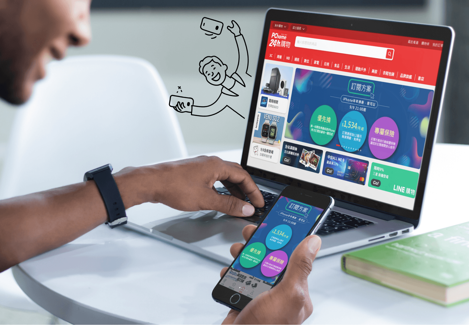
Project Overview
For over 20 years, PChome's website has been a part of life for 10M+ members. But for a long time, signing up and logging in wasn’t as easy as it should’ve been. I stepped in to redesign the experience by clearing up confusion, removing friction, and making it easier for people to get started.
* Launched in 2023, this design remains active and in use.
ROLE
Lead Product Designer / UX Designer
DURATION
6 Months
DESIGN TOOLS
Axure
Before
After
Results
Sold Out in 30 Minutes
25% Reduction in Customer Complaints
New Growth Opportunities
Design Challenges
Prior to starting this project, we received user feedback indicating difficulties with logging into our website. Since PChome allowed users to create unlimited accounts, many ended up with multiple accounts, often forgetting their passwords or which account they had used. With these issues in mind, we decided to conduct a thorough review of our login and sign-up systems to identify and address the underlying causes.
User Journey Maps
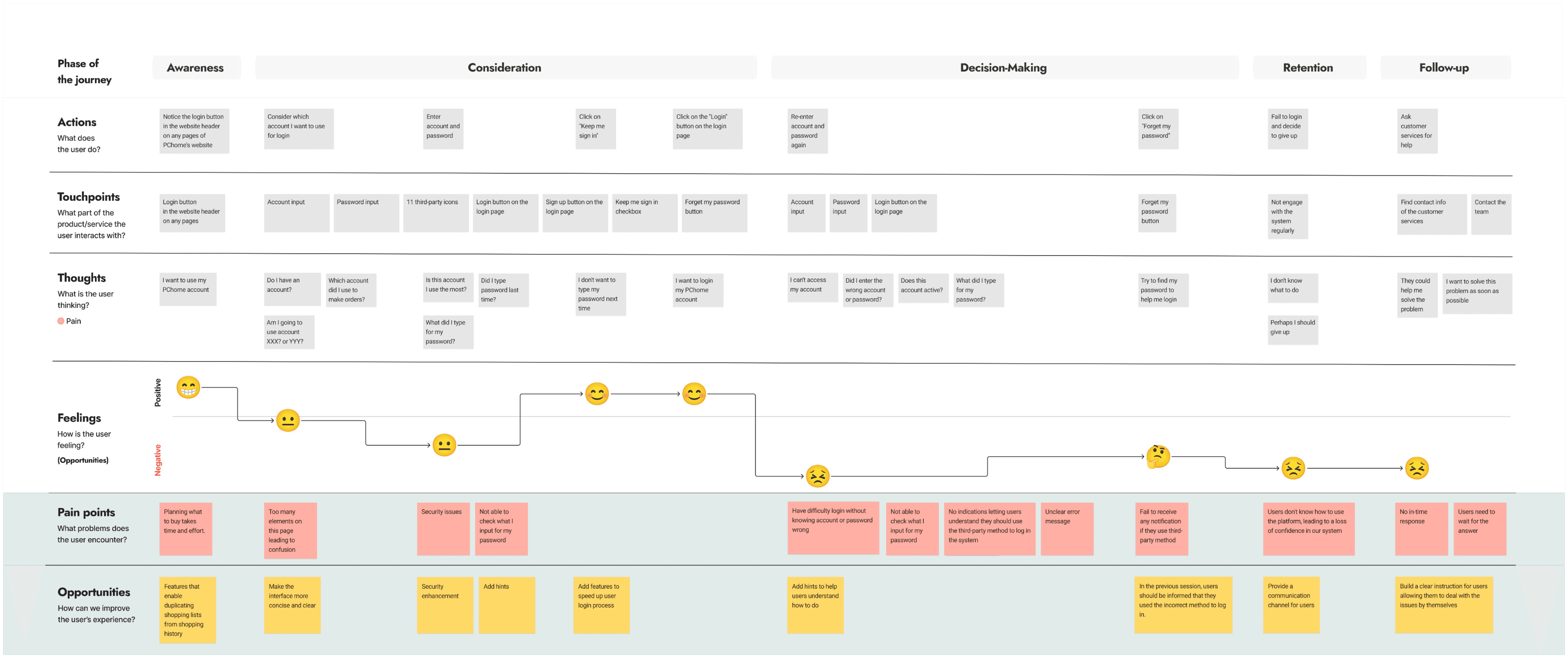
To view the clear journey map, please click the link.
To gain a deeper understanding of our users, I conducted stakeholder interviews, analyzed data from Google Analytics, and extensively studied competitors. This research revealed two major issues: excessive and inconsistent elements on the website created confusion in operations, and users often forgot which account they were using. This was largely due to the lack of account sign-up restrictions, allowing users to create multiple accounts freely. To address these issues, I decided to focus on the following questions:
How might we enhance the clarity of instructions and evaluate the necessity and unnecessity of sign-up and login pages?
Agile Project Management
To ensure users could experience improvements quickly, the project was divided into three phases to prioritize critical updates and gather feedback iteratively. This approach minimized disruptions and ensured each phase delivered measurable value.
Clear Guidelines
Workflows & Interfaces
Feature Enhancements
Scrum & Kanban
Given resource constraints and overlapping projects, I broke these phases into Scrum sprints and used Kanban to monitor workflows. One challenge I faced was the unexpected reallocation of resources to other projects, disrupting our timeline. By leveraging these methodologies, I quickly reprioritized tasks, adjusted our timeline, and reallocated resources efficiently.
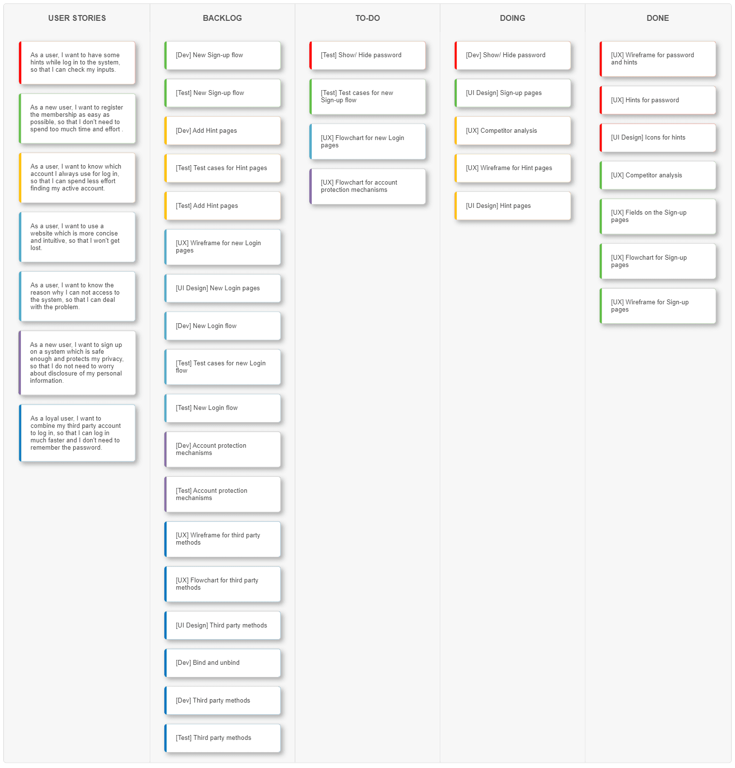
To view the kanban, please click the link.
Design Response
Phase I: Clear Guidelines
I understood that users struggled with logging into our system, so our first improvement was to make the login instructions more clear and visible. This included providing explicit hints, such as the required number of password digits, to guide users seamlessly through the process.
Before
|
After
The new hint allows users to understand what to type in the password field.
(Switch to Desktop or Tablet version for better view.)
Phase II: Workflows & Interfaces
Flowchart
|
Wireframe
|
Mockup
Mockup of the new interface (visual design created in collaboration with our UI designer).
Phase III: Feature Enhancements
After refining the main login and signup flow, I focused on enhancing the user experience by improving additional features, such as enabling users to link or unlink third-party accounts directly from their profile page.
Users can link their third-party accounts
for added convenience.
Reflection
Looking back on this design process, I’ve gained several key insights that will significantly shape my future projects.
1. Balancing Design Strategy with Practical Constraints
While ideation sessions generated numerous innovative ideas from research and competitor analysis, policy limitations and tight timelines required prioritization. For instance, enhancing the password hint feature was chosen as a quick, high-impact solution that balanced strategic goals with feasibility.
2. Highlighting the Value of Iterative Improvements
Breaking tasks into smaller deliverables enabled faster user feedback and quicker iterations. This approach streamlined the design process, allowing us to refine features efficiently based on real user experiences and actions.
3. Addressing Accessibility for Minority Users
The mandatory phone number requirement presented challenges for users outside Taiwan. While customer service offered support, we recognize the need for a more inclusive solution and plan to gather diverse user insights to create a more accessible and seamless platform experience in the future.
Ultimately, these lessons have reaffirmed my commitment to rigorous problem framing and user-centered validation, all of which will be foundational in my approach to future projects.
See Other Designs
Let's Have Some Fun Together!
Copyright © 2025 Maggie Lin. All rights reserved.
Let's Have Some Fun Together!
Copyright © 2025 Maggie Lin. All rights reserved.
Let's Have
Some Fun Together!
Copyright © 2025 Maggie Lin. All rights reserved.