Project Overview
Trader Joe’s is known and loved for its one-of-a-kind products. But as shopping habits shift, the brand faces growing competition. The pandemic changed how people shop, with more customers turning to online ordering and delivery. Since Trader Joe’s doesn’t offer delivery, the challenge became: how can the website better support customers while staying true to the in-store experience? I designed a solution that supports changing customer needs while preserving the in-store experience.
UI/UX Designer / Researcher
DURATION


Design Challenges

Customers care about price and convenience—but without good planning tools, grocery trips often take longer than expected and lead to unplanned purchases. Many shoppers already try to prepare by making handwritten lists or checking what’s in their fridge, but these methods can be messy and easy to forget. On top of that, it’s hard to make confident decisions when product details like price and availability aren’t clear.
These insights led me to explore how a mobile app could help. What if we gave shoppers a simple way to organize their list, check real-time product info, and plan their trip more efficiently—all before they even step into the store?
Design Response
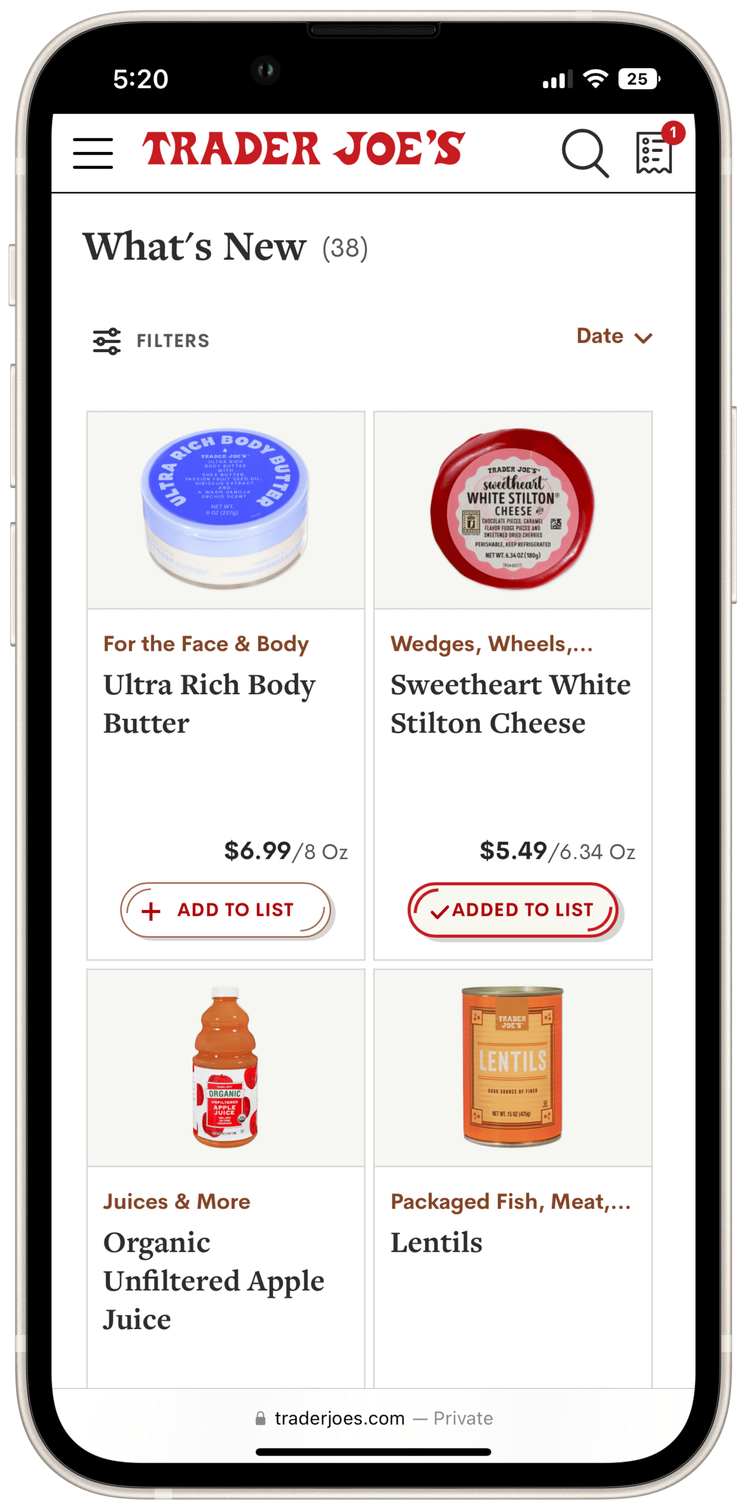
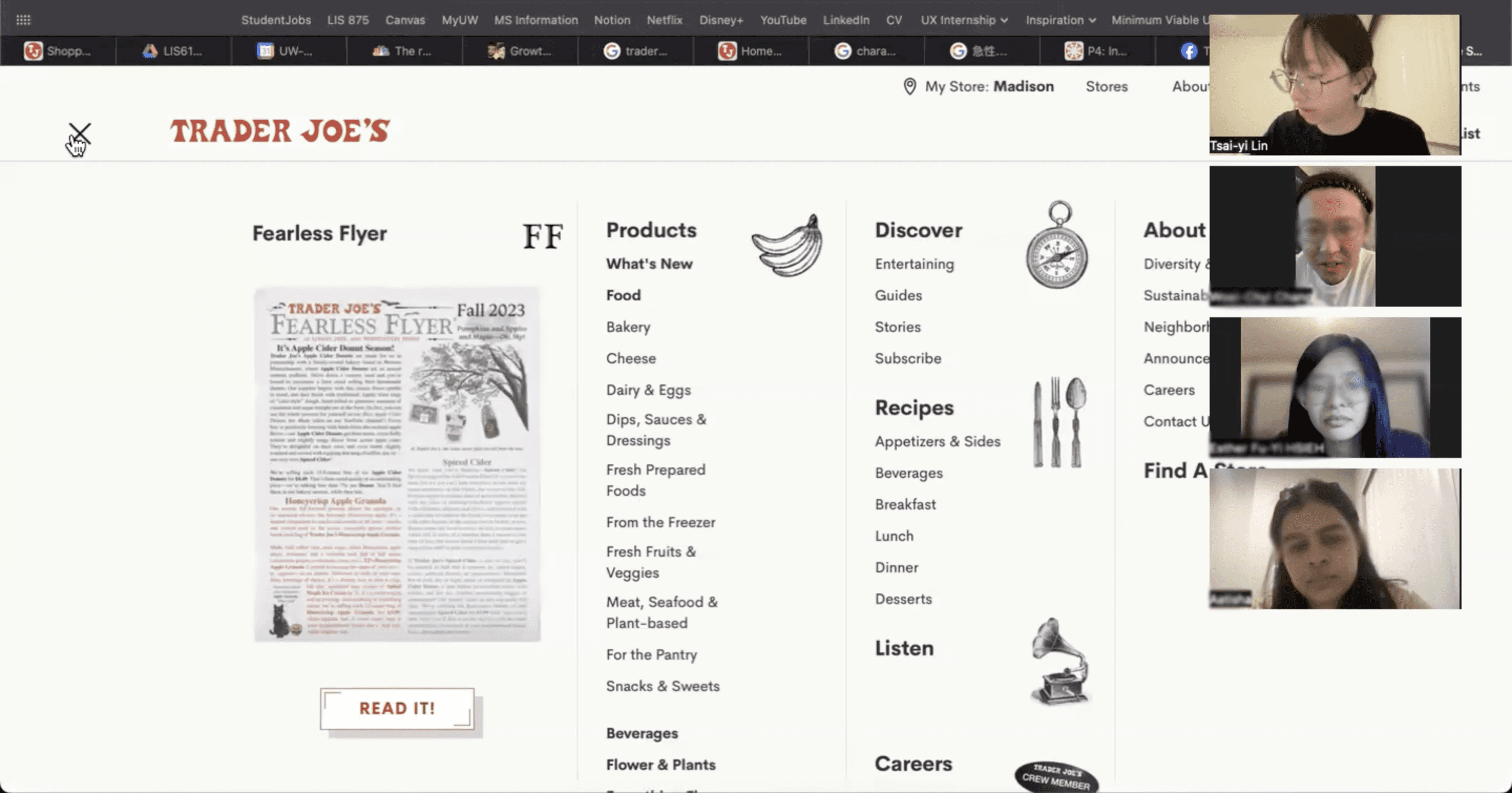
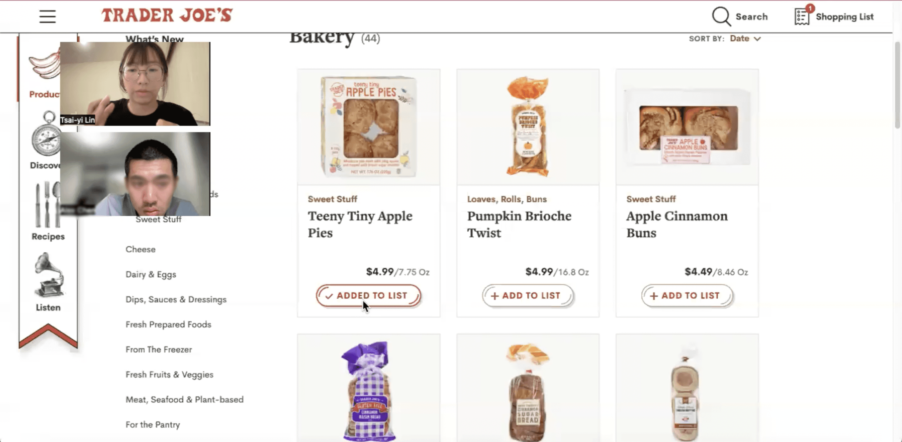
At the time of my research, Trader Joe’s did not offer a mobile app, and its website only allowed users to create a shopping list without tracking availability. If an item went out of stock—or if a user navigated away from the page—their list could disappear, making trip planning inconvenient.
To support better planning and reduce shopping frustration, I designed features that make list-building smarter and more personalized:
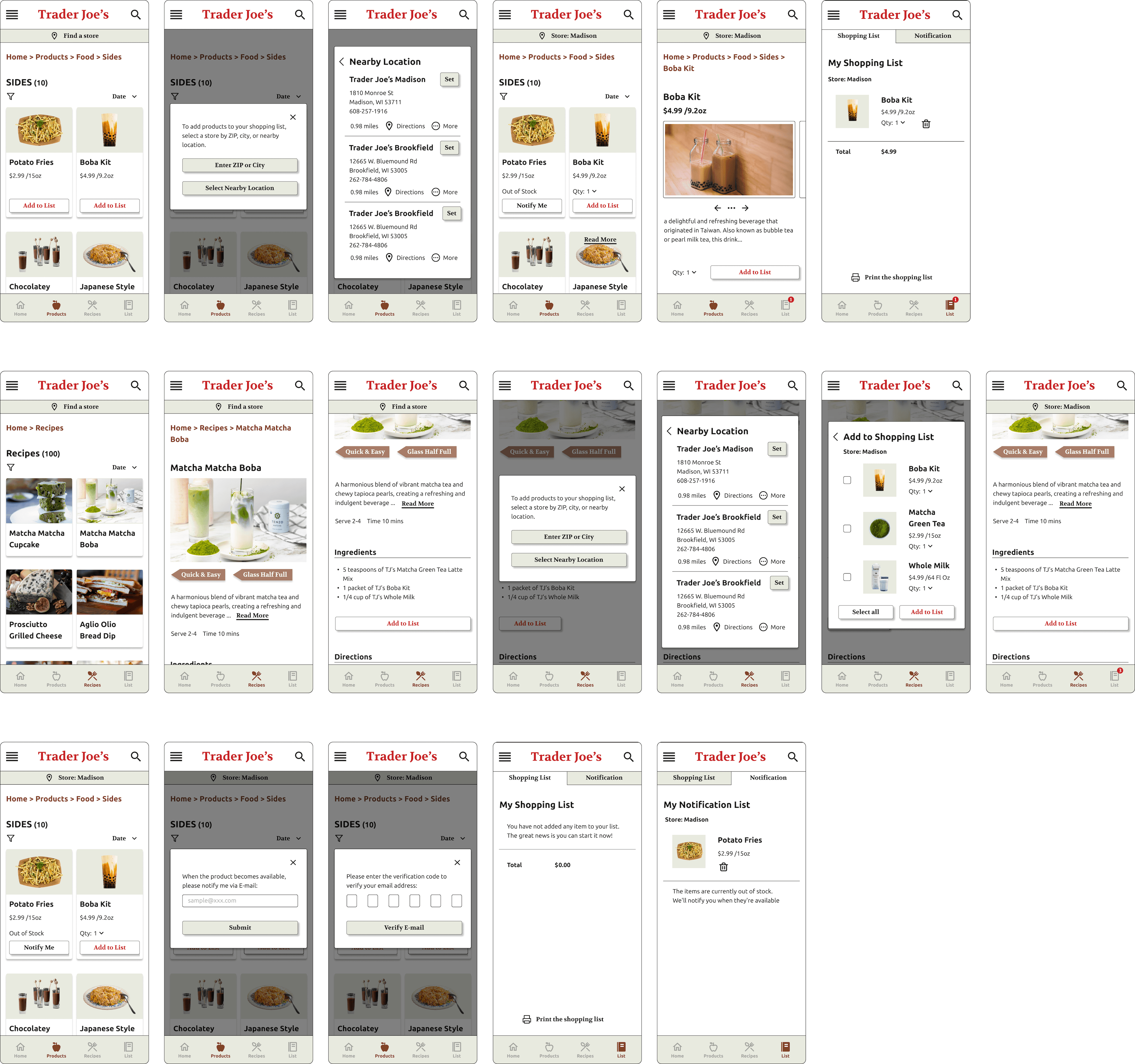

Prototype
Research & Methods
A customer survey showed that 78.7% of respondents shopped online for groceries during the COVID-19 pandemic (Redman, 2020). As a Trader Joe’s shopper myself, I know the brand prides itself on its in-store experience, which sets it apart from other grocery chains.
This contrast sparked my curiosity: Why have shopping habits changed so much? And more importantly, how can Trader Joe’s continue to succeed without offering online delivery?
To explore this, my research focused on two key questions:
How Did I Conduct the User Research?
Target Population
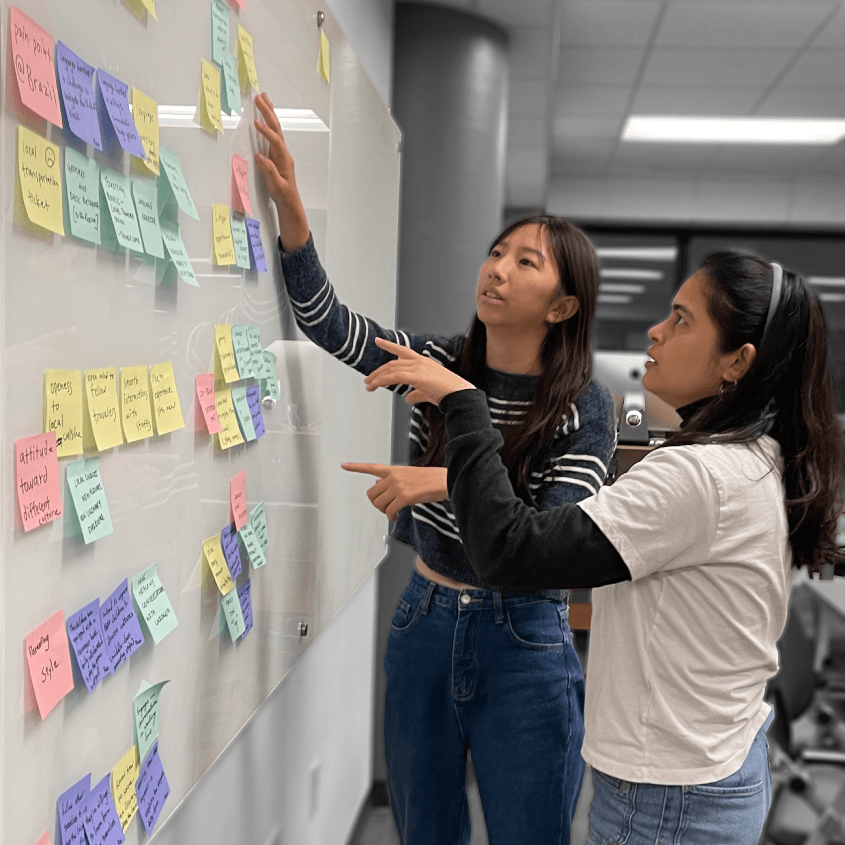
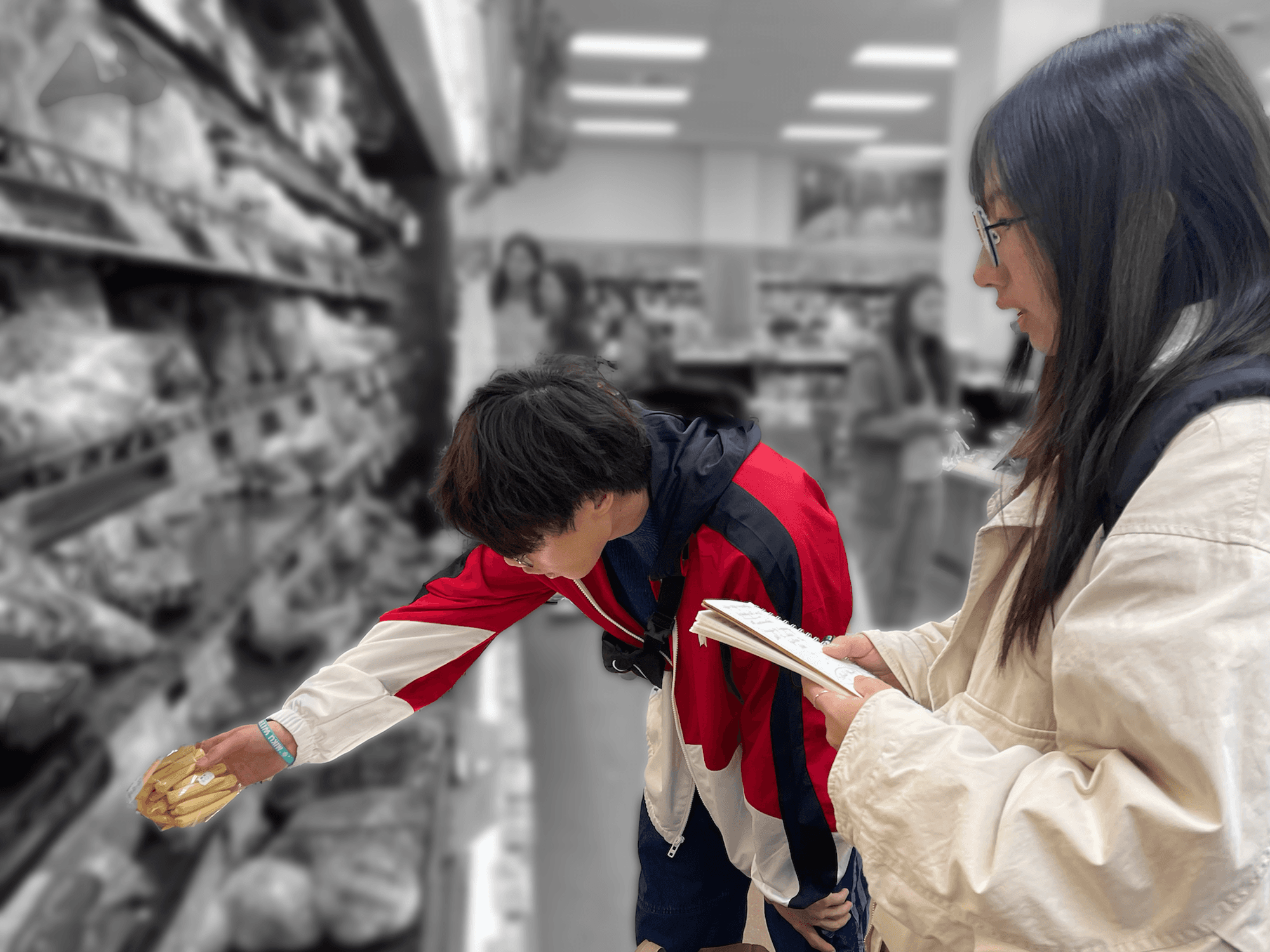
Methodology
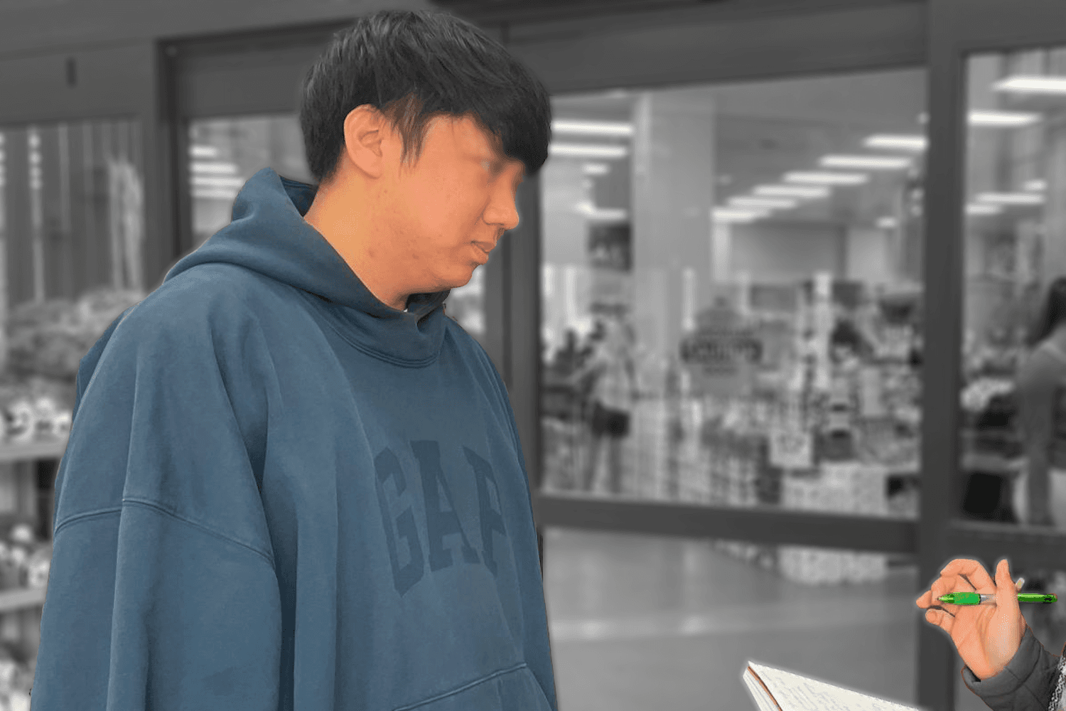
User Empathy

Key Findings
My research showed that price and convenience drive most grocery shopping decisions. Shoppers made intentional choices—48% prioritized price, and 20% valued convenience. One participant even said he always used delivery services to avoid the hassle of in-person shopping.
Despite Trader Joe’s strong brand, its website was largely overlooked. 64% had never visited it, and 23% used it rarely, mostly because they weren’t aware of what it offered. This revealed a clear opportunity to improve the online experience and better support customers before they shop.


Budget-Convenience
Preferences

Infrequently Access
Trader Joe's Websites
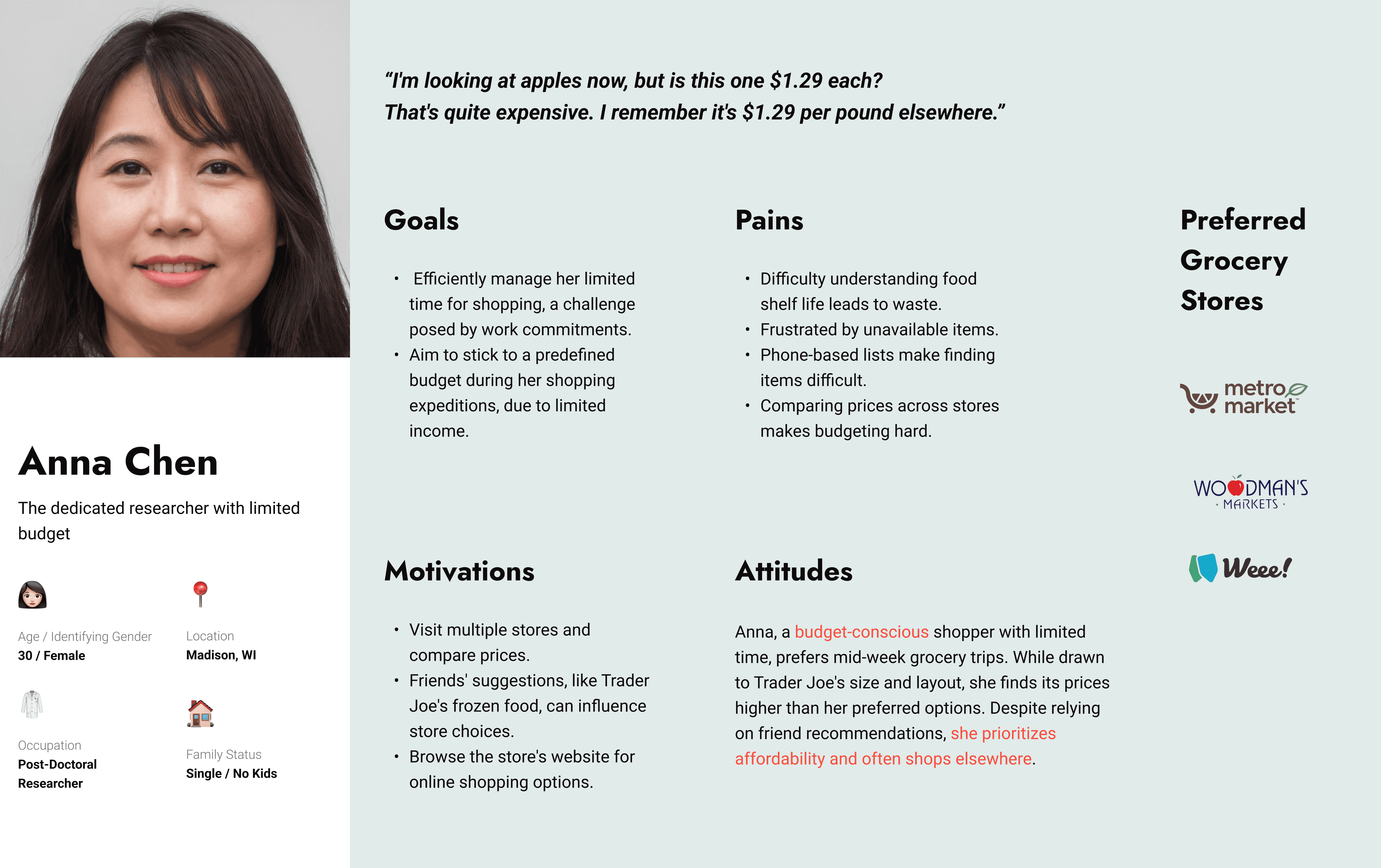
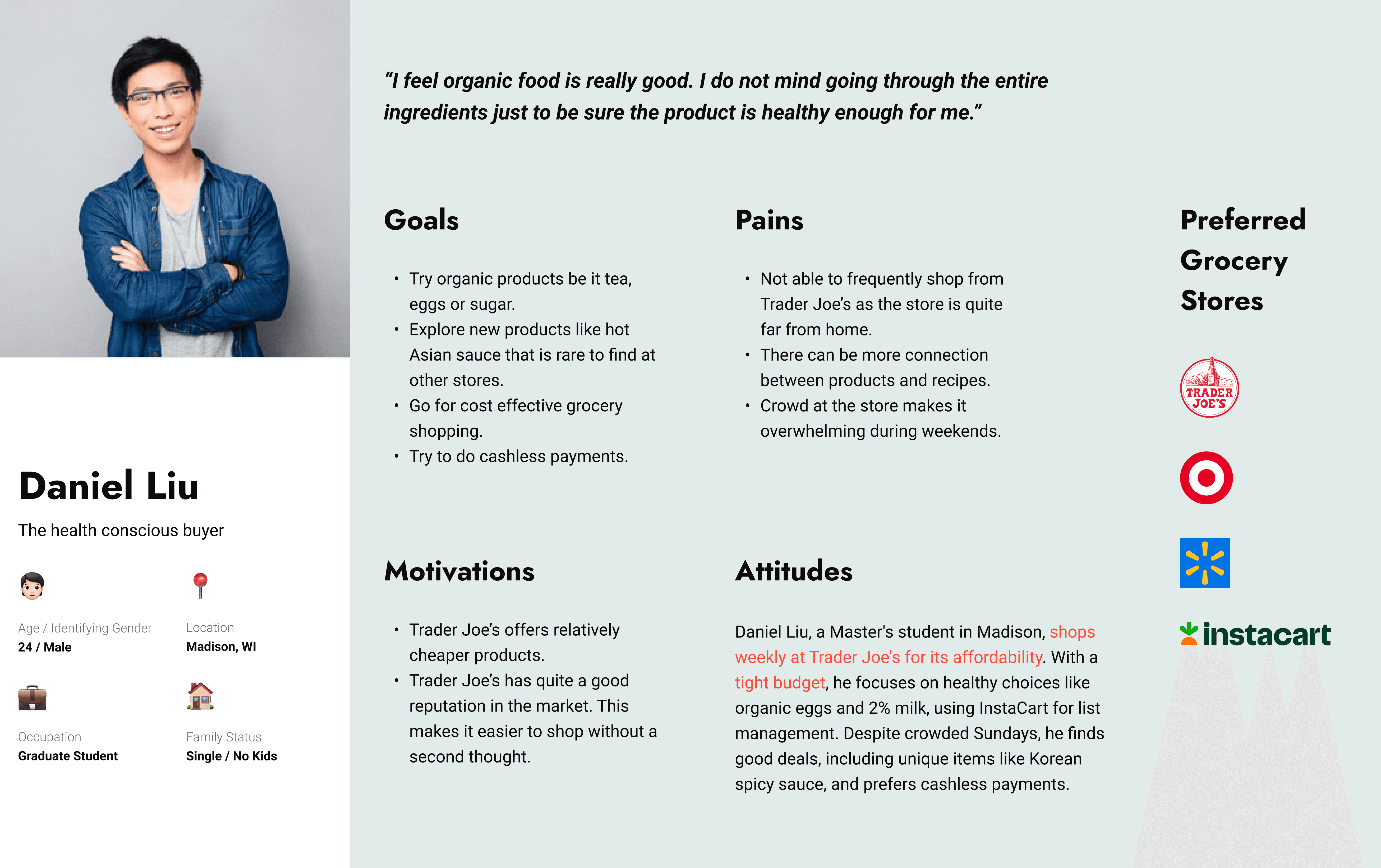
Building Personas
Budget and convenience preferences clearly shaped how people approached grocery shopping, leading to distinct behavior patterns. To reflect these differences, I created three personas representing key customer types: (1) budget-conscious, occasional Trader Joe’s shoppers, (2) budget-conscious, frequent shoppers, and (3) efficiency-driven shoppers with no budget concerns. Each persona highlights unique motivations, priorities, and habits, offering meaningful insights into user needs and expectations.
User Journey Maps for Trader Joe's website
The “Add Items to List” feature on Trader Joe’s website is meant to help users check prices and organize their shopping, but efficiency makes all the difference. By mapping each persona’s journey through the site, I identified key pain points in the Pre-Purchase and Product Navigation stages. These moments heavily influenced overall satisfaction, as users often struggled with deciding what to buy and finding items quickly. This led to frustration and longer shopping times, revealing clear opportunities to improve the experience.
Reflection
Looking back on this design process, I’ve gained several key insights that will significantly shape my future projects.
1. A Clear Problem Statement Is Everything
At first, my problem statement was too broad, which created confusion and made it harder to focus design efforts. Once I refined it, everything became clearer—goals aligned, decisions felt more intentional, and the entire process flowed better. It was a strong reminder of how critical it is to start with a well-defined problem.
2. Design Decisions Should Be Grounded in User Insights
Prototyping and testing early helped me uncover usability issues I hadn’t anticipated. These user-centered, hands-on methods gave me practical, objective insights that guided better design choices. They also reinforced how important it is to test assumptions and stay connected to real user behavior.
This project reaffirmed my commitment to clear problem framing and user validation—two practices I’ll continue to rely on in every project going forward.